海草
@yyj1983@fans.fans
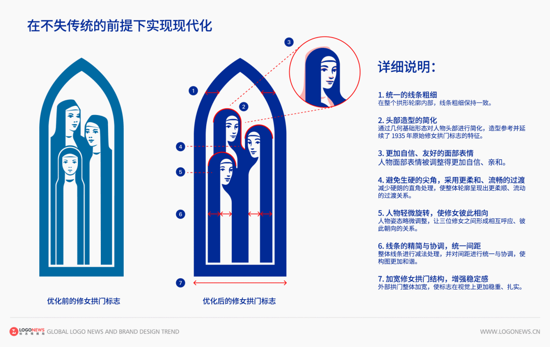
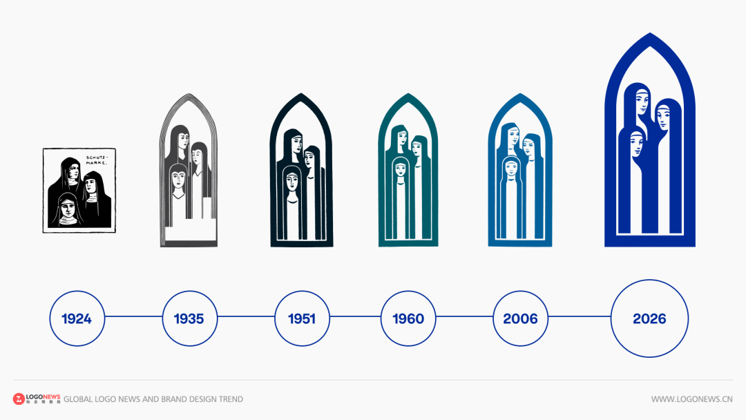
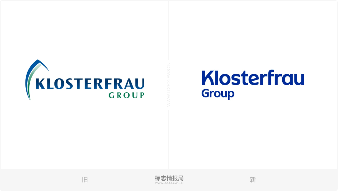
德国百年药企德国修女(Klosterfrau) 为迎接2026年成立200周年,联合设计机构升级品牌LOGO与视觉系统。
- 品牌背景:1826年创立,旗下有超220款产品,原修女标志认知度达96%。
- 图形优化:精简三位修女造型,统一线条、简化头部、优化表情与姿态,加宽拱门更稳重。
- 文字升级:全大写改为大小写混排,取消渐变,改用蓝色单色,首字母呼应拱门轮廓。
- 升级目的:保留传统的同时适配数字与包装场景,提升识别度。
@yyj1983@fans.fans
德国百年药企德国修女(Klosterfrau) 为迎接2026年成立200周年,联合设计机构升级品牌LOGO与视觉系统。
- 品牌背景:1826年创立,旗下有超220款产品,原修女标志认知度达96%。
- 图形优化:精简三位修女造型,统一线条、简化头部、优化表情与姿态,加宽拱门更稳重。
- 文字升级:全大写改为大小写混排,取消渐变,改用蓝色单色,首字母呼应拱门轮廓。
- 升级目的:保留传统的同时适配数字与包装场景,提升识别度。
@yyj1983@fans.fans
ai真的不错,为另一个网站域名做了个logo。
https://home.fans
@yyj1983@fans.fans
PostgreSQL的LOGO原来也是大象,跟mastodon一样,好巧。

@yyj1983@fans.fans
@yyj1983@fans.fans · Reply to 海草's post
@yyj1983@fans.fans

@herzenschein@furry.engineer
I did a cool dumb thing using #Krita (openSUS) and #Inkscape (fedorable)
openSUS is not an original idea, but I didn't see anyone make a good shareable version
fedorable is an original idea using the floof emoji from @volpeon


@herzenschein@furry.engineer
I did a cool dumb thing using #Krita (openSUS) and #Inkscape (fedorable)
openSUS is not an original idea, but I didn't see anyone make a good shareable version
fedorable is an original idea using the floof emoji from @volpeon
@herzenschein@furry.engineer
I did a cool dumb thing using #Krita (openSUS) and #Inkscape (fedorable)
openSUS is not an original idea, but I didn't see anyone make a good shareable version
fedorable is an original idea using the floof emoji from @volpeon
@herzenschein@furry.engineer
I did a cool dumb thing using #Krita (openSUS) and #Inkscape (fedorable)
openSUS is not an original idea, but I didn't see anyone make a good shareable version
fedorable is an original idea using the floof emoji from @volpeon
@herzenschein@furry.engineer
I did a cool dumb thing using #Krita (openSUS) and #Inkscape (fedorable)
openSUS is not an original idea, but I didn't see anyone make a good shareable version
fedorable is an original idea using the floof emoji from @volpeon
@herzenschein@furry.engineer
I did a cool dumb thing using #Krita (openSUS) and #Inkscape (fedorable)
openSUS is not an original idea, but I didn't see anyone make a good shareable version
fedorable is an original idea using the floof emoji from @volpeon
@sherold@mastodon.online
If you ever feel sad, just remember that there's an official logo for the sudo command, and it's an enthusiastic sandwich.

@sherold@mastodon.online
If you ever feel sad, just remember that there's an official logo for the sudo command, and it's an enthusiastic sandwich.
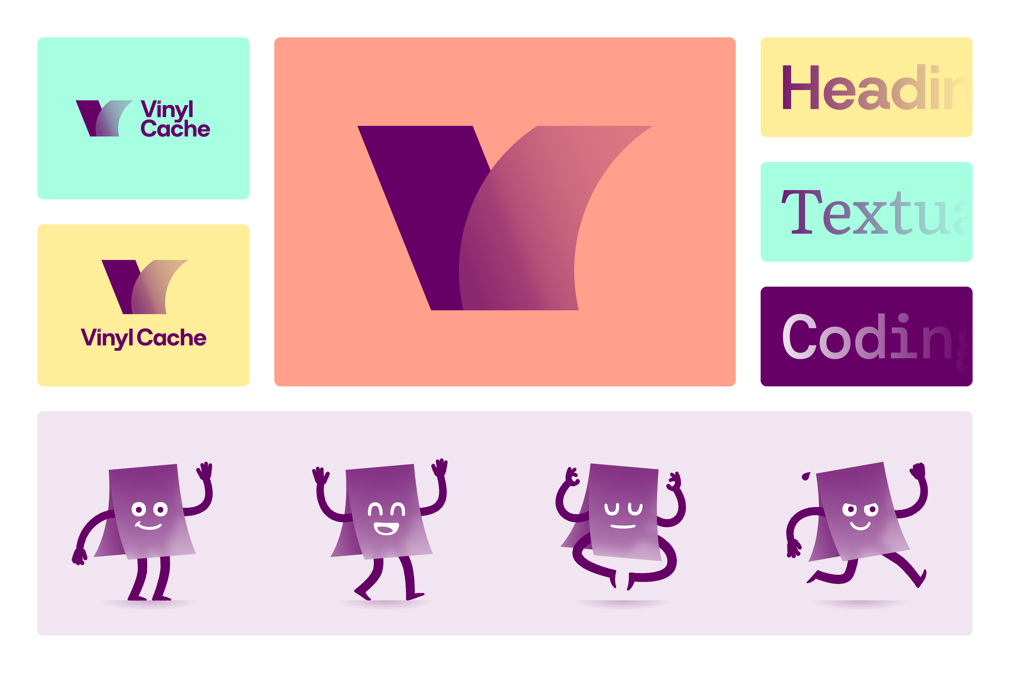
@rhubarbe@mastodon.design
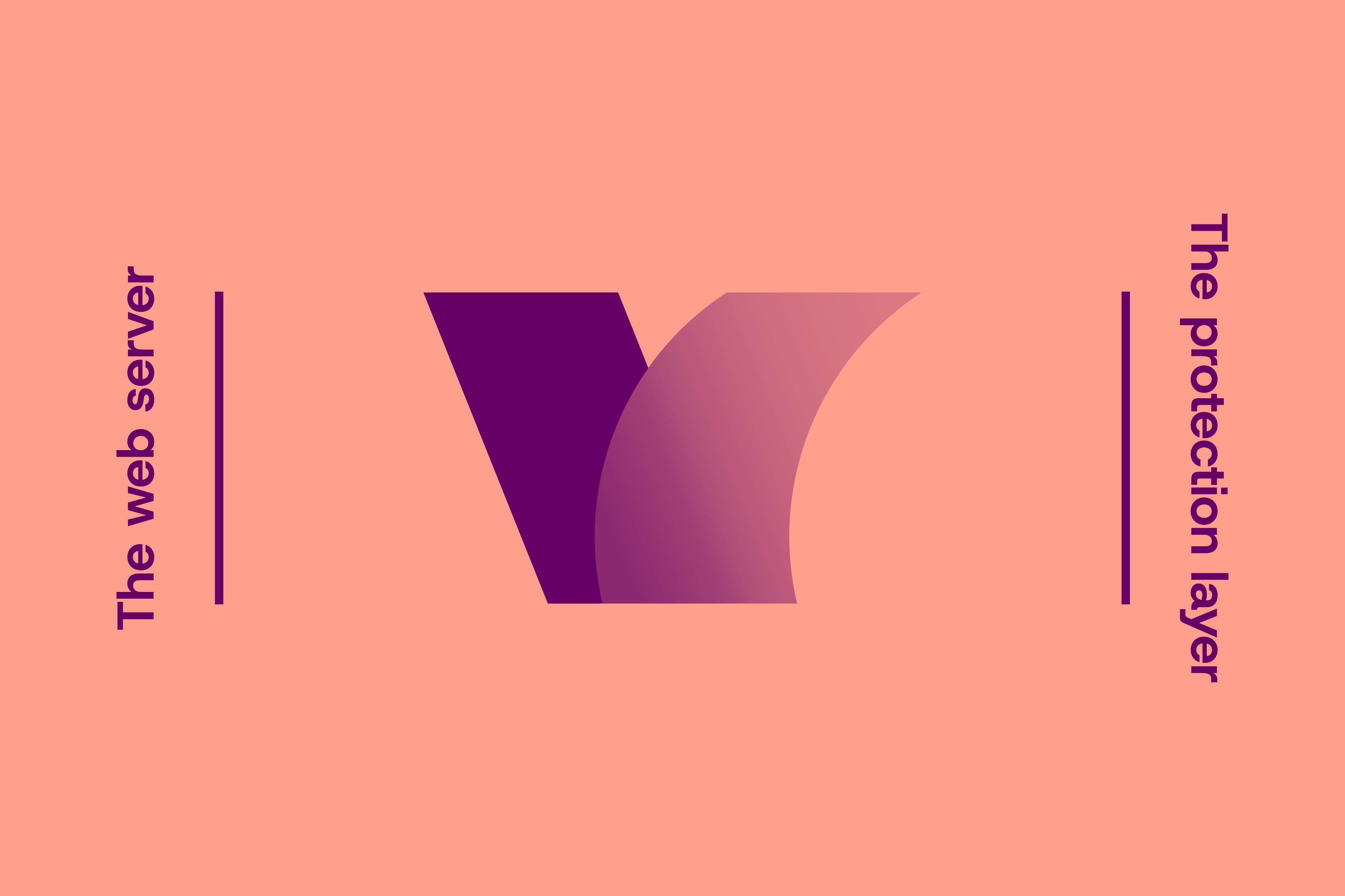
Happy to share a project I have been working on: a new visual identity for Vinyl Cache!
Installed in front of a web server, it makes websites faster to load.
The new logo stems from a simple concept: Vinyl Cache protects the server just like vinyl film protects what it’s applied on.
The symbol combines a solid block representing the website and a translucent flexible layer as the cache. Together, they form a V monogram, along with a customised wordmark.
1/3
@rhubarbe@mastodon.design · Reply to Rhubarbe's post
It isn’t just the logo :)
Meet the Vinyl Ghost, a new mascot for the project.
A mystic but friendly creature who nests on web servers. Like hermit crabs, it caches itself underneath a sheet of vinyl. Yet, it’s always out there to lend a hand delivering webpages.
I drew the mascot in a few different poses and expressions, with possibilities to create more in the future!
And of course, visual identity classics: colour palette, typeface selection.
2/3

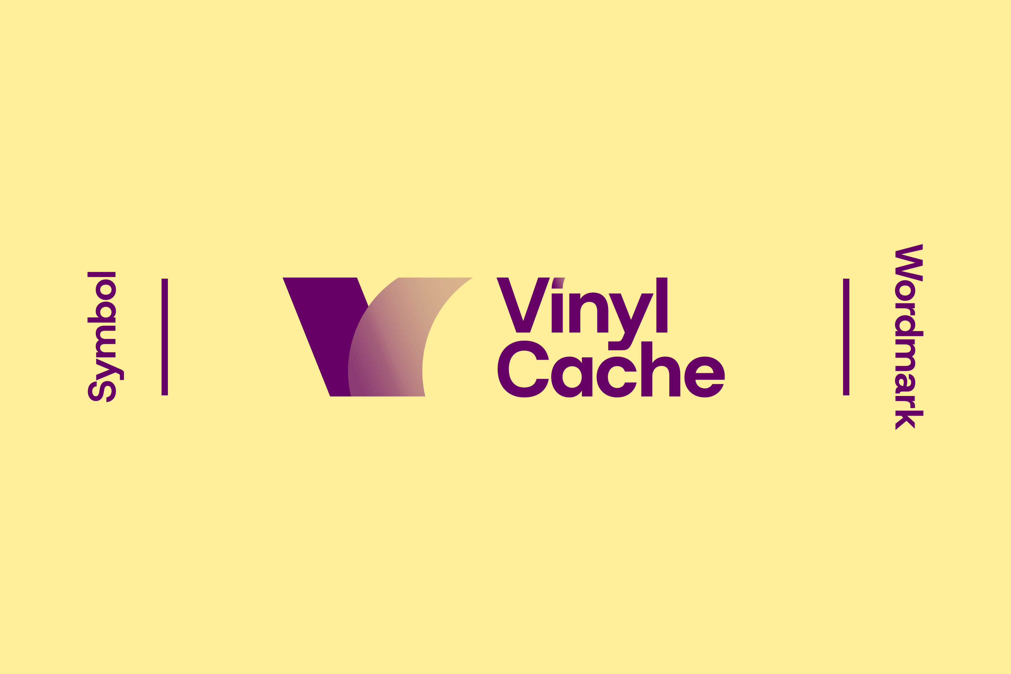
@rhubarbe@mastodon.design
Happy to share a project I have been working on: a new visual identity for Vinyl Cache!
Installed in front of a web server, it makes websites faster to load.
The new logo stems from a simple concept: Vinyl Cache protects the server just like vinyl film protects what it’s applied on.
The symbol combines a solid block representing the website and a translucent flexible layer as the cache. Together, they form a V monogram, along with a customised wordmark.
1/3
@UbuConAsia@mastodon.social
Check out our new #logo for this year's #UbuCon Asia 2026 @ #COSCUP! #FormosanBlackBear #UbuConAsia @COSCUP

@UbuConAsia@mastodon.social
Check out our new #logo for this year's #UbuCon Asia 2026 @ #COSCUP! #FormosanBlackBear #UbuConAsia @COSCUP
@UbuConAsia@mastodon.social
Check out our new #logo for this year's #UbuCon Asia 2026 @ #COSCUP! #FormosanBlackBear #UbuConAsia @COSCUP
@jfml@mastodon.art
Hiya! 😺 Let's get FediHired! 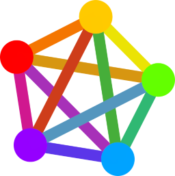 ⁂
⁂
I'm a designer and illustrator who works exclusively with open source tools, thanks to #Inkscape, #Scribus, #Krita etc. (can do #Adobe #CreativeSuite if needed). 📕
Also up for 3D-animated, interactive, immersive projects (#Fulldome / #VR w #Blender #Godot) 🌌

#JfmlArt #art #illustration #creative #design #typography #GraphicDesign #logo #icon #DigitalArt#FediHire #FediHired #GetFediHired #FOSSdesign #OpenSource
@jlow@pixelfed.social
@jfml@mastodon.art
Hiya! 😺 Let's get FediHired! ⁂
I'm a designer and illustrator who works exclusively with open source tools, thanks to #Inkscape, #Scribus, #Krita etc. (can do #Adobe #CreativeSuite if needed). 📕
Also up for 3D-animated, interactive, immersive projects (#Fulldome / #VR w #Blender #Godot) 🌌
#JfmlArt #art #illustration #creative #design #typography #GraphicDesign #logo #icon #DigitalArt#FediHire #FediHired #GetFediHired #FOSSdesign #OpenSource
@jlow@pixelfed.social
@stefan@stefanbohacek.online
The proposed (and widely used) fediverse logo is now part of the Font Awesome library.
@stefan@stefanbohacek.online
The proposed (and widely used) fediverse logo is now part of the Font Awesome library.
@stefan@stefanbohacek.online
The proposed (and widely used) fediverse logo is now part of the Font Awesome library.
@kevinrns@mstdn.social · Reply to Chester Wisniewski's post
@BenjaminHimes@fediscience.org
I am looking for someone who can take some ideas i have for a business logo, sketched out with evil ai, and then improve them with a human touch.
My requirements are fairly simple, but it will be trademarked so they need to be okay with assigning copyright for the design.
Fee negotiable.
Please boost, I’m not sure what tags to use for this. More details in Alt
#art #FediHire #design #logo #graphicdesign #science #sciart

@Troll@maly.io
C'est forcément un sketch... 
https://www.fastcompany.com/91481010/trump-designed-a-logo-for-peace-it-leaves-out-half-of-the-world
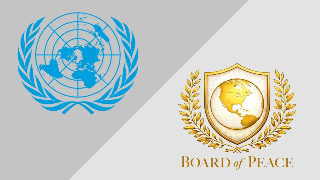
@Troll@maly.io
C'est forcément un sketch...
https://www.fastcompany.com/91481010/trump-designed-a-logo-for-peace-it-leaves-out-half-of-the-world
@openstreetmap@en.osm.town
State of the Map 2026, the annual global OpenStreetMap conference, will take place in Paris.
Calling all creative minds! The Call for Logos for the SotM 2026 conference is now open.
The logo is a crucial element in defining the design and colour scheme.
We welcome everyone, from experienced graphic design professional to hobbyist and newbies, to share your innovative visual ideas with the community!
Read more: https://wiki.openstreetmap.org/wiki/State_of_the_Map_2026/Call_for_Logos
@thisismyglasgow@mastodon.scot
A heavily worn Automatic Telephone Manufacturing Company access cover from George Square in Glasgow. It most likely dates from between 1911 and 1932 (when the company changed its name to the Automatic Telephone and Electric Company). Despite the company's name, it's part of an old automated traffic light system. The font for the ATM logo is just so wonderfully Art Nouveau.
@mray@social.tchncs.de · Reply to elementary's post
@elementary your post promotes Microsoft services with a bigger logo than your own.
Doesn't look good on you – at least in my book.

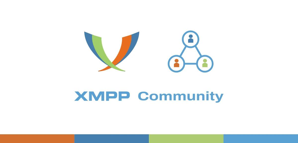
@xmpp@fosstodon.org
#XMPP Community
User & developers are spread #world-wide in the XMPP community!
This is a call to show where you are! 🌍🌎🌏
Post a photo with the XMPP #logo and a nice view of your location 📷
Add city name and country, too.
#jabber #chat #rtc #standards #decentralization #federation #messaging

@doctormo@floss.social
Based on @lorenipsum's post about python being all backbone (software) and @ThePSF's refusal to roll over. I give you my sticker idea¹
Notes: This confluence of puns tickles me. supine sounding like serpentine and spine and being upside-down, aforementioned backbone, nod to "don't tred on me" and *maybe* a wink to Tiresias and hitting snakes.
OK back to code.

@stefan@stefanbohacek.online
Missed this yesterday when the World Wide Web Consortium (W3C) announced a new logo.
"The previous logo and tagline served us very well for more than twenty years. Our new logo captures our essence as a solid, innovative, and evolving organization."
Interesting!
@inautilo@mastodon.social
#Development #Announcements
W3C’s new logo and tagline · ”Making the web work, for everyone.” https://ilo.im/167bom
_____
#Logo #Tagline #W3C #Mission #Community #OpenWeb #WebStandards #WebDev #Frontend #Backend
@inautilo@mastodon.social
#Development #Announcements
W3C’s new logo and tagline · ”Making the web work, for everyone.” https://ilo.im/167bom
_____
#Logo #Tagline #W3C #Mission #Community #OpenWeb #WebStandards #WebDev #Frontend #Backend
@neppy@woof.tech
Created a new logo for myself. :3

@metal_zealot@metalhead.club
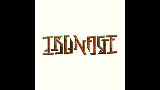
Iron Age
#history #prehistory #iron #ironage #art #ambigram #ambigrams #calligraphy #typography #lettering #wordart #wordplay #logo #logoart #rotationalambigram #ambigramart
#symmetry #rotation #rotational #graphicdesign #type #font #fonts #creative #design
@metal_zealot@metalhead.club
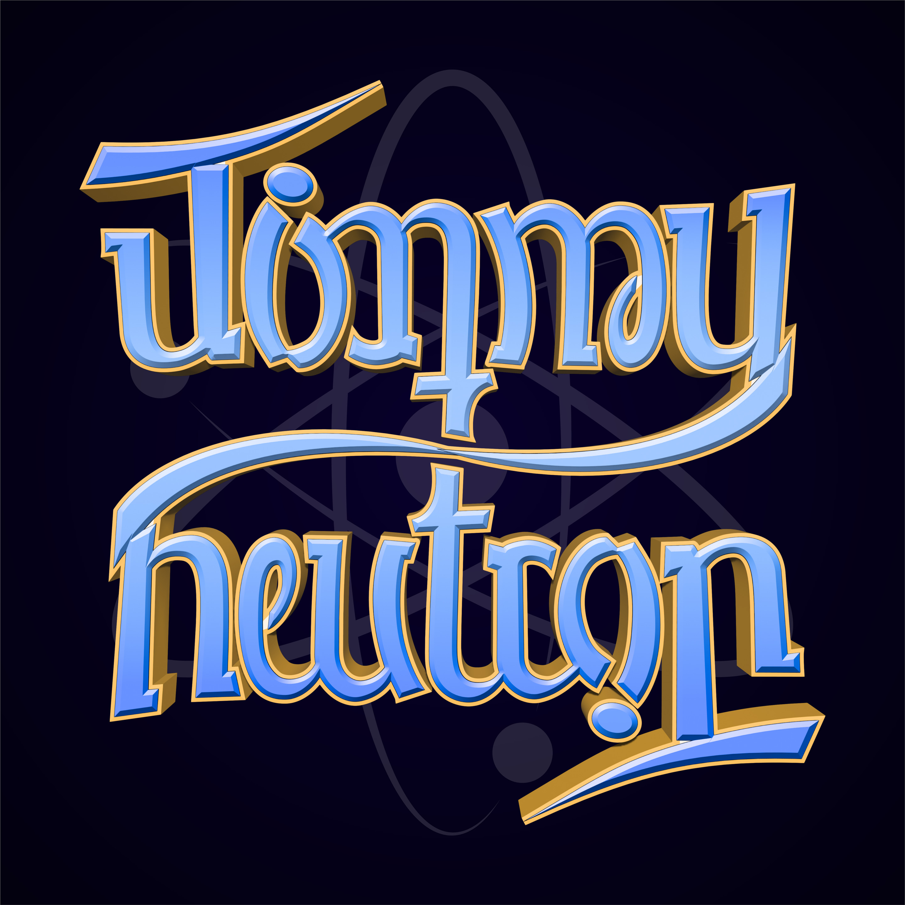
Jimmy Neutron
#JimmyNeutron #Nickelodeon #cartoon #3dcartoon
#art #ambigram #ambigrams #typography #lettering #wordart #wordplay #rotationalambigram #ambigramart
#symmetry #rotation #rotational #graphicdesign #type #font #fonts #creative #design #logo
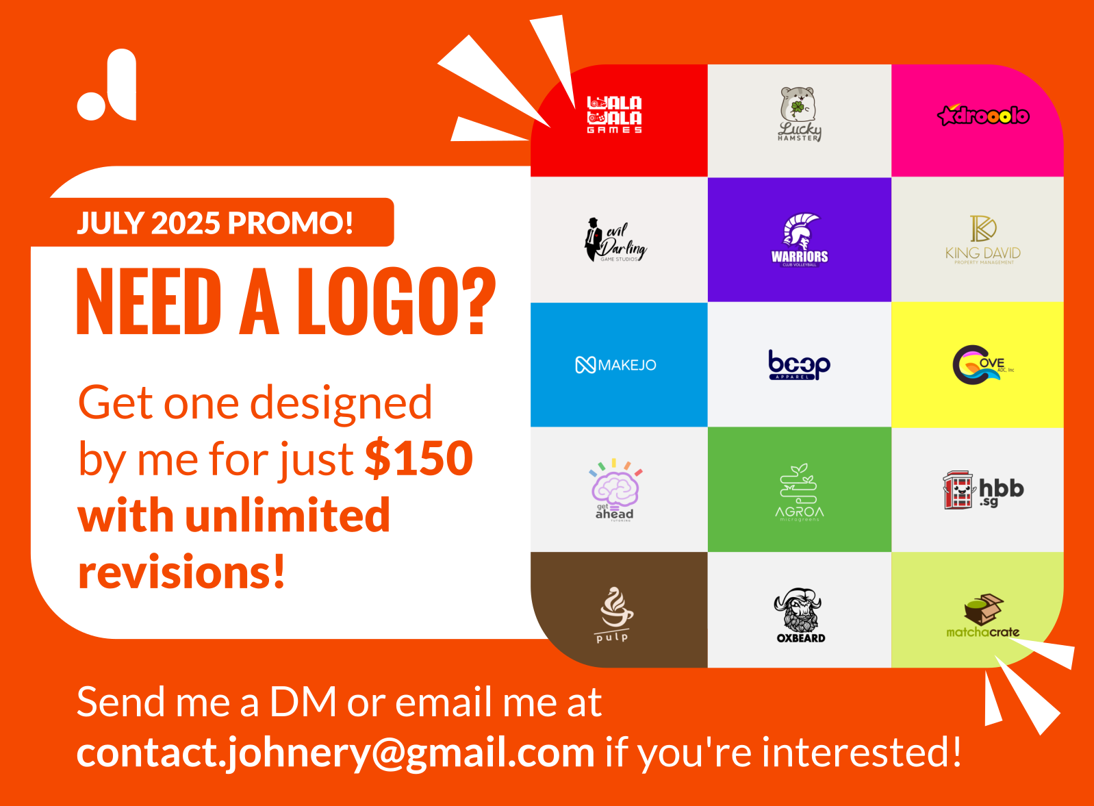
@johnerycreatives@mastodon.social
It's July, which means I'm available for more logo commissions!
If you know someone who needs a logo, please feel free to tag them here.
@ning@social.lol
#introduction
Hi! I’m Ning, and I’m interested in #fitness #books #movies #film #music #writing #lettering #logo #logodesign #design #photography #gadgets #app
I just started using Mastodon on this social.lol instance. I absolutely have no idea how it works yet, but I’m so happy to meet new people here! 
You can know more about me through all my online presence here: https://about.ningkantida.com/

@vivarado@typo.social

@zeldman@front-end.social
@zeldman@front-end.social
@rhubarbe@mastodon.design
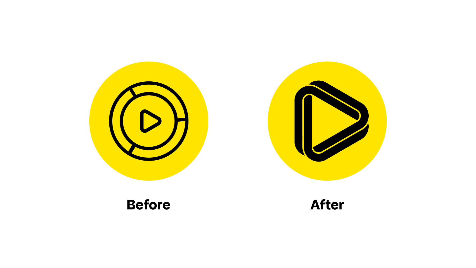
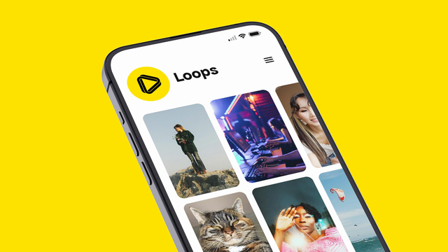
Earlier this year, I had the occasion to design a new logo for the video sharing app @loops 😊
Turning the play symbol into a Möbius strip-like design reintroduces the notion of “loop” into the icon. I also created several animated versions, playing with the infinite construction of the design, for various uses such as loading screens and video idents.
Thanks @dansup for your trust! You can go try the app here: https://loops.video


@rhubarbe@mastodon.design
Earlier this year, I had the occasion to design a new logo for the video sharing app @loops 😊
Turning the play symbol into a Möbius strip-like design reintroduces the notion of “loop” into the icon. I also created several animated versions, playing with the infinite construction of the design, for various uses such as loading screens and video idents.
Thanks @dansup for your trust! You can go try the app here: https://loops.video
@Vivaldi@vivaldi.net

@Vivaldi@vivaldi.net
@Vivaldi@vivaldi.net
@Vivaldi@vivaldi.net
@jesscanady@hachyderm.io
Hey chooms, I need a logo created for a fictitious, nonexistent, fucking made up company.
I'm not going o Fiverr to have some AI slop thrown at me by the lowest bidder. I'd rather pay someone from here for high quality work, which leads me to:
## If you're interested in designing a slick, cyerbpunk, techy, phoenix-esque logo, hit me up with your rates.
@hhwerbefrei@bewegung.social · Reply to Initiative Hamburg Werbefrei's post
Egal ob mit Sammelerfahrung aus anderen #Initiativen oder ohne, es lohnt sich - viele kennen uns jetzt und kommen auf uns zu, sobald sie jemanden mit dem HWF-#Logo sehen!
@hhwerbefrei@bewegung.social · Reply to Initiative Hamburg Werbefrei's post
Egal ob mit Sammelerfahrung aus anderen #Initiativen oder ohne, es lohnt sich - viele kennen uns jetzt und kommen auf uns zu, sobald sie jemanden mit dem HWF-#Logo sehen!
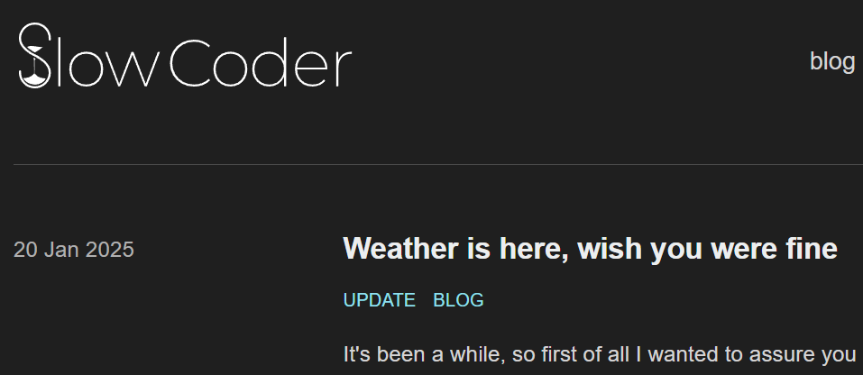
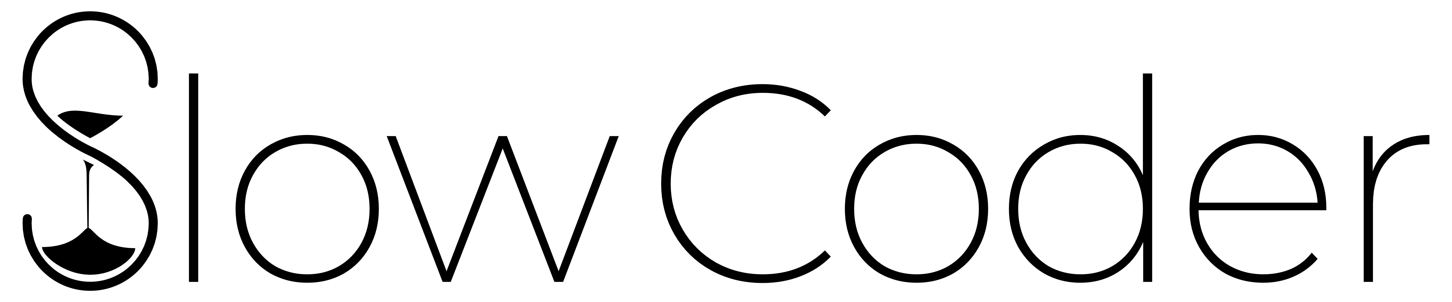
@samuteki@ohay.ooo
This is the logo for https://www.slowcoder.org that I finished a little while ago. I think this is my first project with a client from the Fediverse, so I'm quite glad it came out well :)
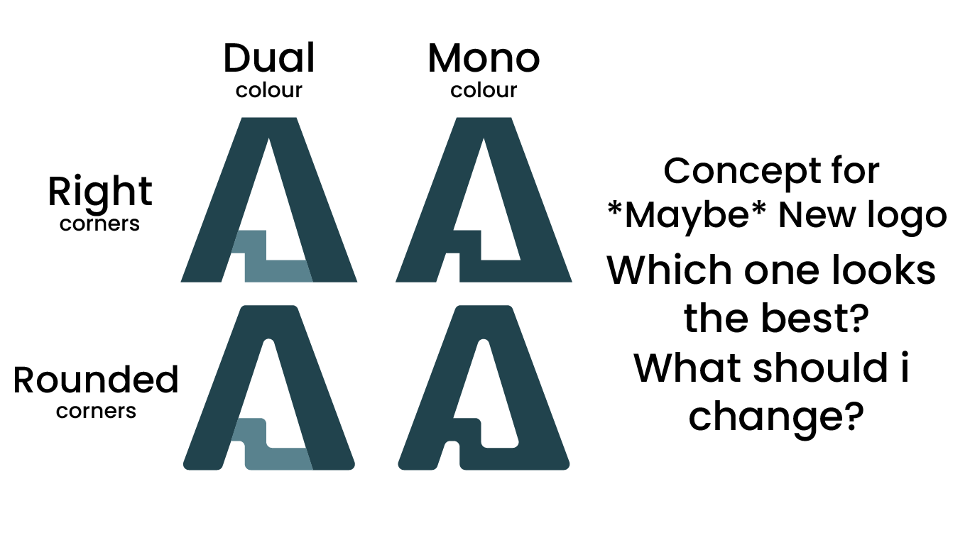
@andrecon@mastodon.social
Jadies, lentilmen and @avery + @CheeseGrader
Concept art Time! Maybe I will release new Andrecon Logo, who knows?
I come up with this design on de toilet lol
These are the concepts! Dual Colour, Mono Colour Rounded and Straight Corners. Imma work on the colours later, but first i wanna know which one is the best
@MBrandtner@gruene.social
Ich habe gerade alle Kinderinterviews von Logo mit den Spitzenkandidaten bei der Bundestagswahl gesehen. Während Merz, Wagenknecht und Weidel keine 10 Minuten Zeit für Kinder übrig haben, war Markus Söder der einzige der Befragten, der während des Interviews schlecht über andere Politiker geredet hat (und das gleich zwei Mal). Scholz und Lindner waren unauffällig, nur bei Habeck und van Aken hatte ich das Gefühl, dass sie wirklich gut mit Kindern können.
@drawing@posts.mu7ou.com

@downey@floss.social
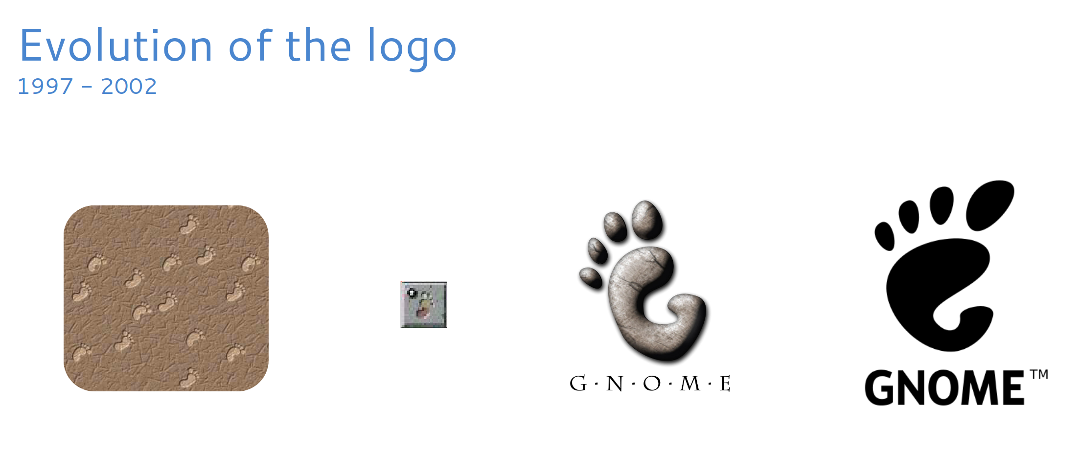
 RIP #GNOME logo ... we barely knew ya. 1997-2025
#BrandEquity #logo #branding #OpenSource #FreeSoftware #FOSS #FLOSS
@jeromyokc@okla.social · Reply to Jeromy's post

@Jeremiah@alpaca.gold
The European Space Agency’s logo sucks compared to NASA’s and Svenska Space Corporation’s. It looks like an early rejected draft of the Microsoft Edge logo and misreads as EESA instead of ESA.


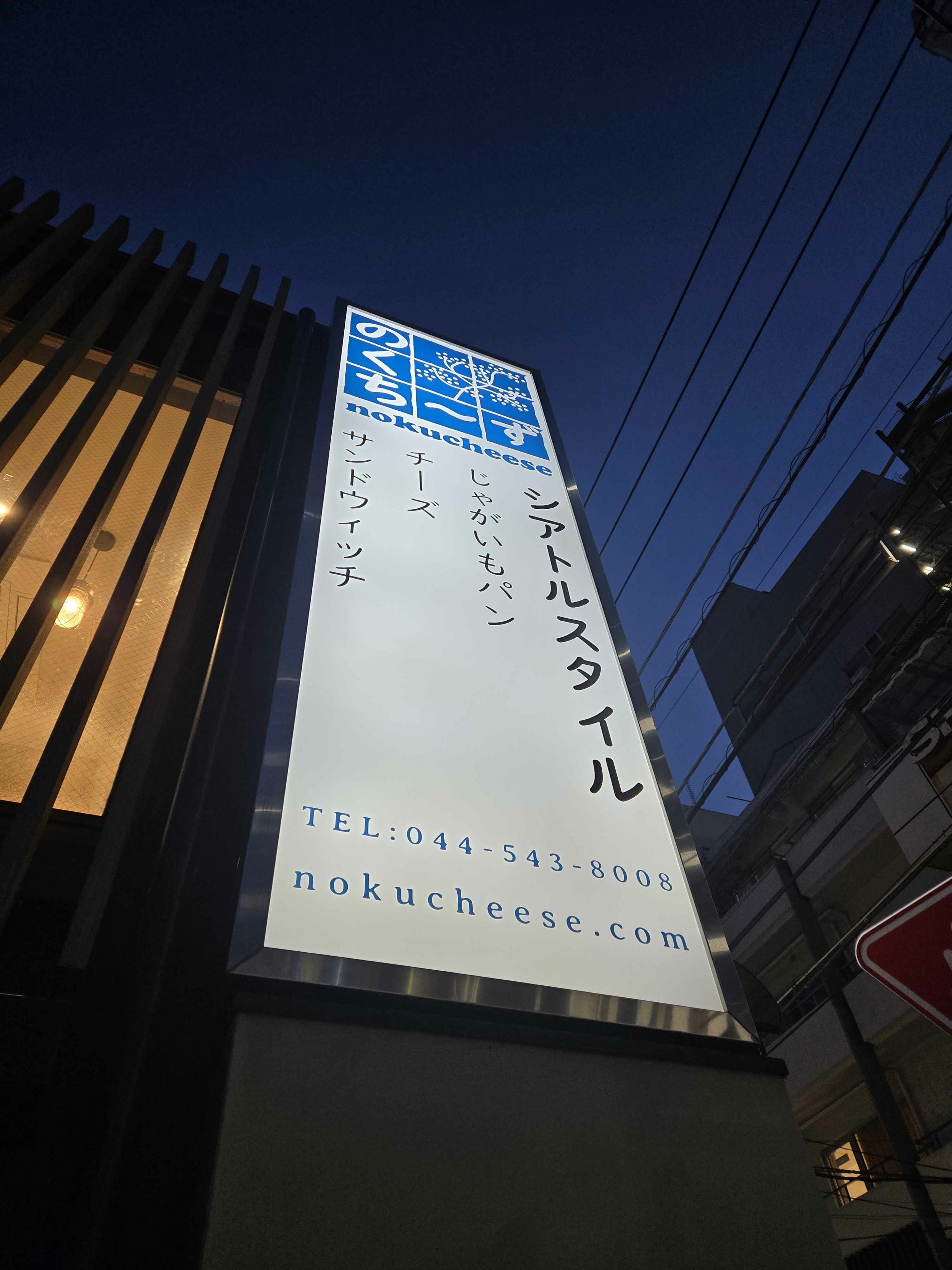
@samuteki@ohay.ooo
Got the okay to share these photos. Since I don't do a lot of self-promotion for my logo design, please indulge me a little.
@JohneryCreatives@socel.net
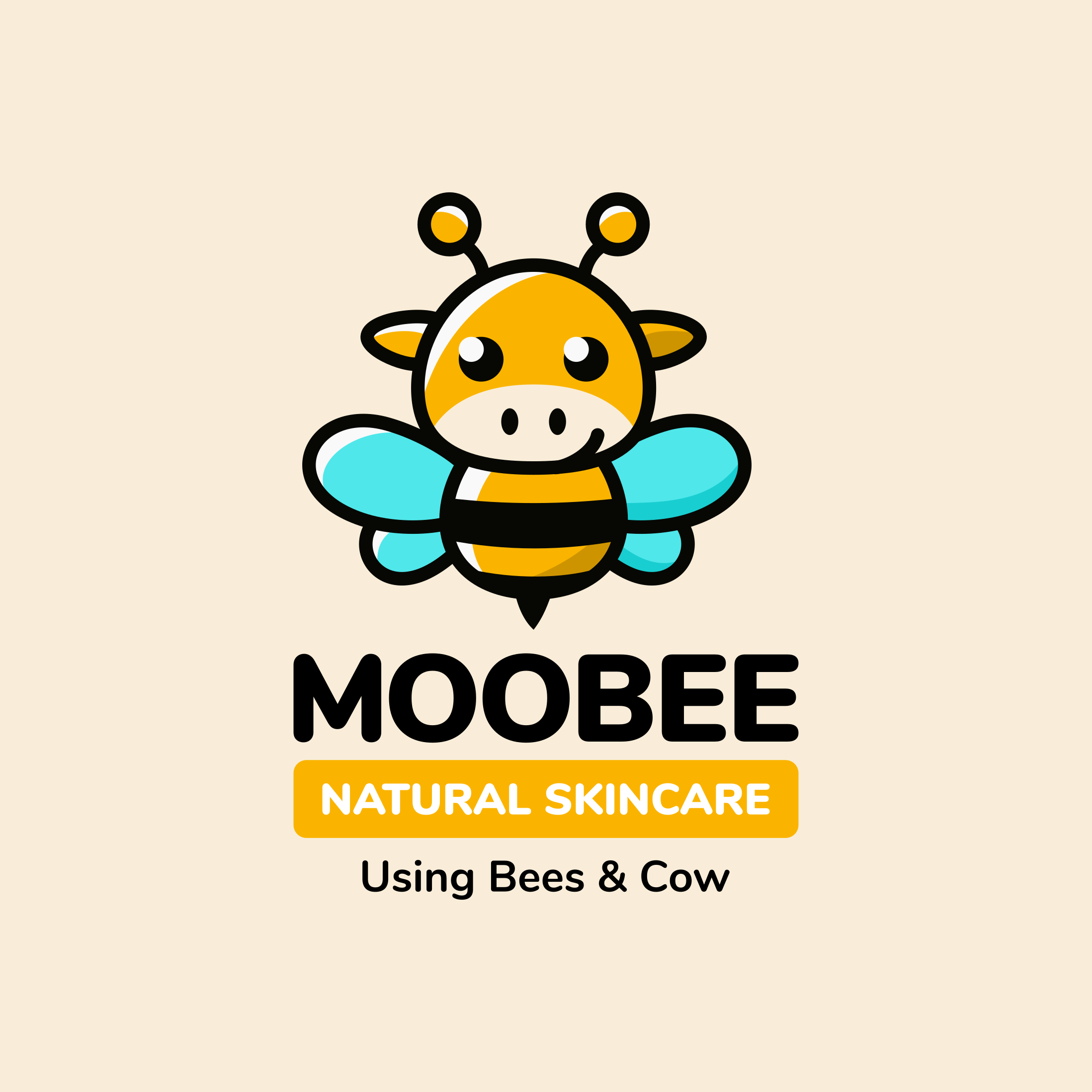
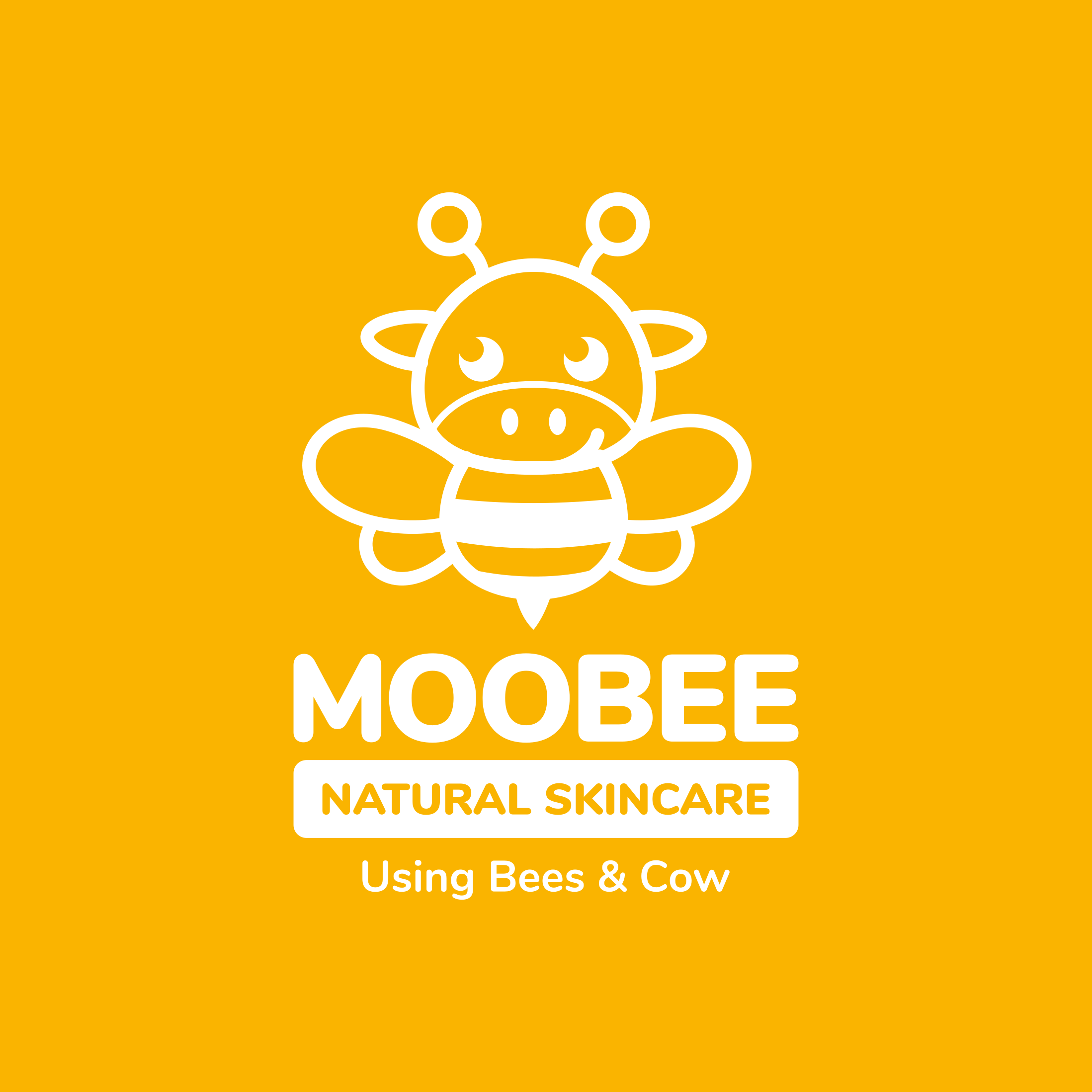
A logo I designed for a new company that makes lotions, soaps, and candles the old way using beef tallow, beeswax, and honey.
The client had a rough concept that they liked, but wanted a professional's touch to make it perfect.
I'm available for new projects! Please visit my website at https://johnery.com or message me through email at contact@johnery.com

@JohneryCreatives@socel.net
A logo I designed for a new company that makes lotions, soaps, and candles the old way using beef tallow, beeswax, and honey.
The client had a rough concept that they liked, but wanted a professional's touch to make it perfect.
I'm available for new projects! Please visit my website at https://johnery.com or message me through email at contact@johnery.com
@TyrKilcat@meow.social
Made a content label pack that you all can use for completely free to show off that your art is 100% AI Free :33
kilcat.carrd.co

@JohneryCreatives@socel.net
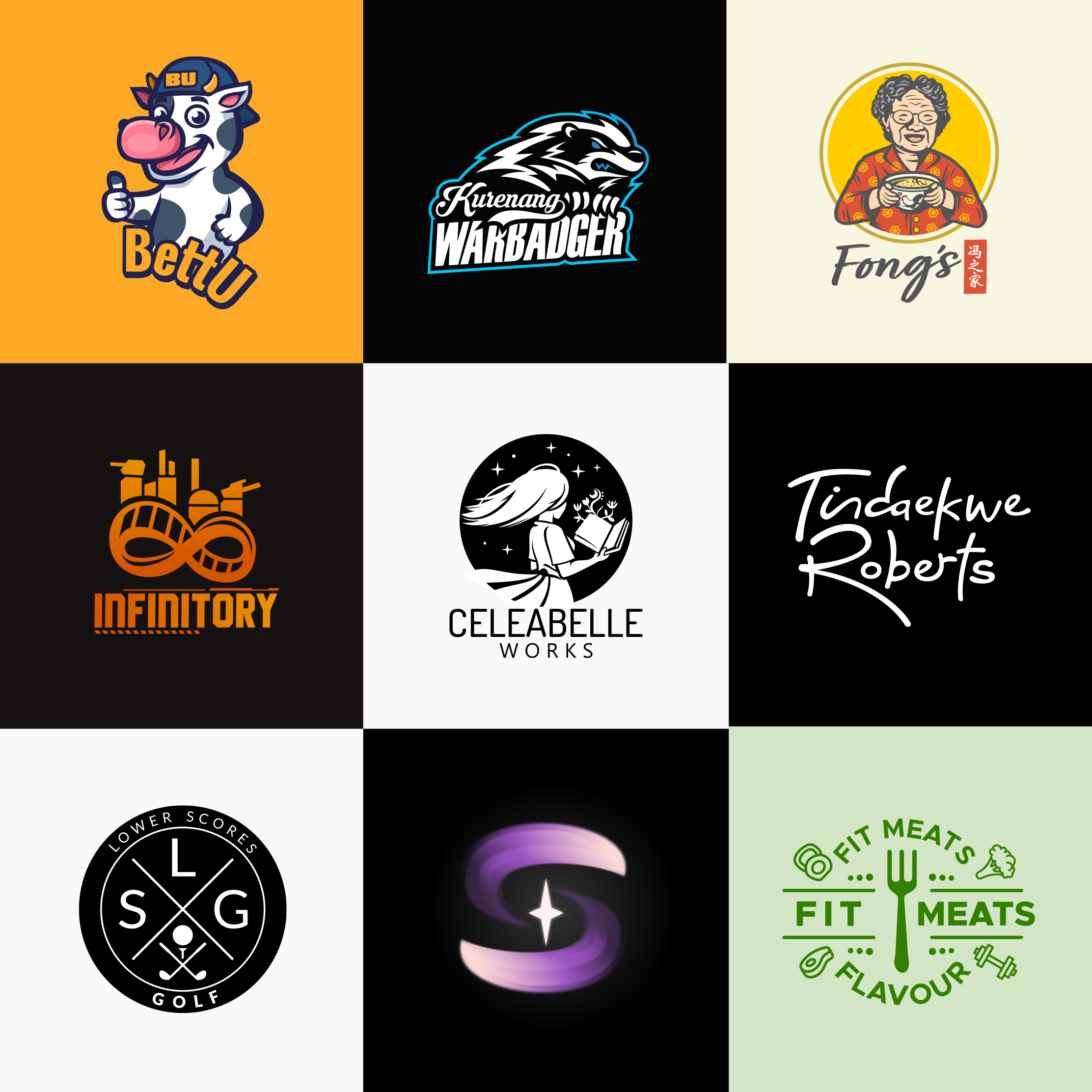
My logofolio for 2024 — really appreciate my clients who trusted my skills and expertise for their branding. Many thanks and wishing everyone a fantastic year ahead!
I'm available for new projects! Feel free to message me here or through email at contact@johnery.com
@blogamf@indieweb.social
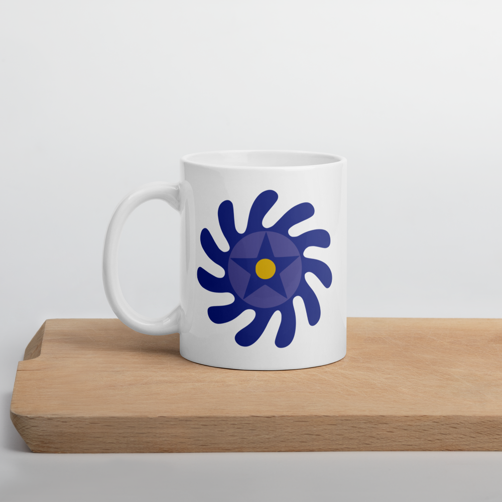
The profile picture (PP) is a mockup of a white mug (here on a table), with the blog's logo: a blue & yellow version of the Ghanaian Adinkra symbol called "Sesa Wo Suban", representing the transformation of life.
@KinocKayfar@dragonchat.org
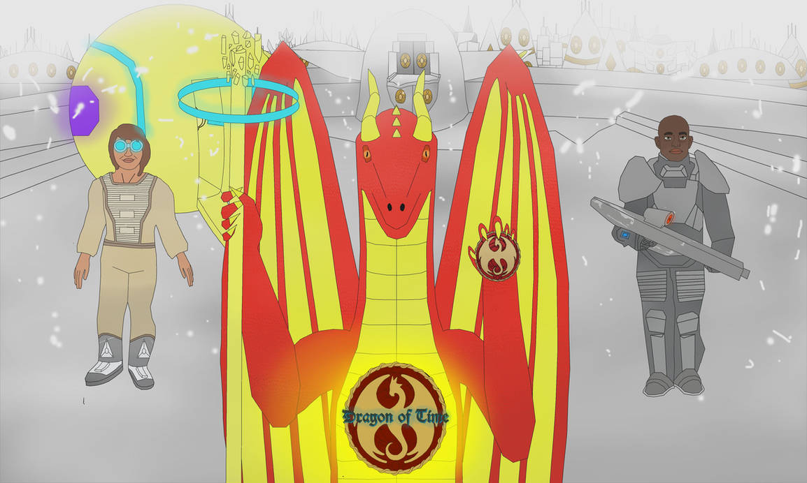
A draconic entity, by the name of Kinoc-Kayfar, falls into a mysterious world with his time traveling ship. Now trapped within this strange universe, aided by two human companions, Yamira and Alexander, they must make unconventional alliance and journey through time and space to ultimately, uncover its nature if they wants to make it back home, and even, fix it.
This is the official community server for "Dragon of time". A epic alterhuman sci-fi space opera featuring time travel, draconic humanoids, and more. Where we join to exchange our point of view of the story and share our thoughts about its worldbuilding. Its also meant as a place where we can freely hangout and have fun together. From voice chats, events, and even a NSFW section. There is something for everyone to have a good time !
#anthro #anthrodragon #digitalart #dragon #furry #human #humans #logo #multiverse #poster #reptilian #scalie #sciencefiction #scientist #scifi #scificharacter #soldier #staff #timemachine #timetravel #furrycharacter #scaliecharacter #worldbuilding #writing #writingcommunity #alterhuman #otherkin #dragonkin
@rozcakj@mefi.social
Who me? Just a #Maker, IT Consultant and "all-around-#nerd".
I grew up watching Saturday morning cartoons, original #StarTrek re-runs, reading #Fantasy & #SciFi (not SyFy), lots of #Lego and eventually graduated to #RPG and #tabletop gaming.
My first computer was a #Commodore Vic-20 - at school, we learned graphical #LOGO on PETS and Apple IIe's... crashed the Unisys ICON network often before getting my first PC - grudgingly - really wanted an #Amiga.
Eventually, it was time for college - I *thought* I would be heavily involved in the physical aspects of technology, circuit design, and hardware engineering - instead, I gravitated to #programming.
My first professional #programming language was #VisualBasic 1.0; eventually, jumping into Borland #Delphi 1.0 and #ObjectPascal - still dabble with #FreePascal #Lazarus, a smidge of #Java, a lot of #CSharp and some #Python. My #JavaScript is ancient...
You can find me online at - https://linktr.ee/jasonkaczor
@oblomov@sociale.network
I have tried to recreate the candidate #Fediverse #logo in a “clean”, hand-coded #SVG (definitions for the nodes, sides and connectors, and then using them placing them on a pentagon by rototranslations, assigning colors according to the original one I found on Wiki
https://commons.wikimedia.org/wiki/File:Fediverse_logo_proposal.svg
I still have to do some tuning to ensure that it matches the original one that appears to be machine-generated with all sorts of decimals all around, but I think I'm already close.

@fedify@hollo.social
#Fedify started out exclusively for #Deno, but now also supports #Node.js and #Bun. However, the #logo we created in the early days still features the character from Deno. Should Fedify change its logo now?
| Option | Voters |
|---|---|
| Yes, because it's misleading. | 5 (28%) |
| A logo is a logo, no need to change it. | 13 (72%) |
@north@ꩰ.com
I'm going to give away my secret, publicly, for the first time.
If you want a symbol that can (possibly) be used in a domain name, this is a good starting point. Many of these will still not render in address bars however, especially those that are Latin look-alikes, so a lot of trial and error is required.
Edit: @FediverseSymbol
@pfefferle@links.pfefferle.org
We propose the symbol ⁂ to represent the fediverse.
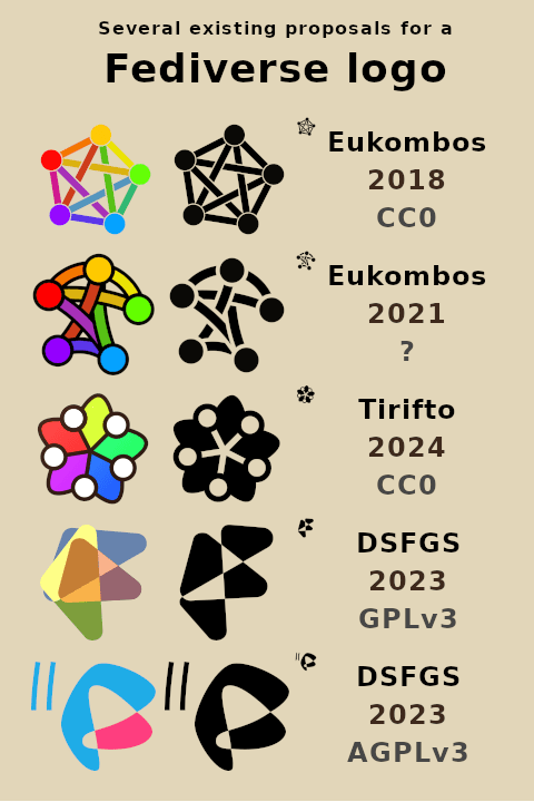
@tirifto@jam.xwx.moe
So I tried making a Fediverse logo! :gutkato_kontenta:
Most people seem to be using the rainbow-coloured pentagram (by Eukombos & al.), which I like well enough myself, but since I read somewhere that it looked a bit busy, I tried making something simpler yet familiar. Instead of different nodes, I put the colours in different spaces/communities formed between the interacting nodes; sorta inspired by the origami boat logo (by DSFGS).
I don’t think the result is particularly striking or much improved, but since I already made it, here it is anyway! Hereby dedicated to the public domain using CC0. I’ve put together a comparison with some pre-existing logos, too; which ones do you like the best? :gutkato_flucerba:
#lang_en #art #CC0 #decentralisation #design #FediArt #FediDesign #FediLogo #Fediverse #FreeCulture #FreeSoftware #LibreCulture #LibreSoftware #logo

@donno@fosstodon.org
Two weeks ago, I saw this really cool Firefox-based browser called Zen. The UI is fantastic to use, but the logo could use some work. It seemed like a fun challenge to tackle.
So I worked with the developer & community on some ideas, and this is what we came up with!
As a cherry on the top, I've added some animation to showcase the logo even better. :)
#browser #zenbrowser #icondesign #design #graphicdesign #logodesign #logo #icons #mograph #motiongraphics #animation


@stefan@stefanbohacek.online
"A lot of people think that the pentacle was chosen because of its occult or satanic connotations. And while it would be in Fediverse's rebellious spirit, this was not the case."
https://stefanbohacek.com/blog/the-history-of-the-fediverse-logo/
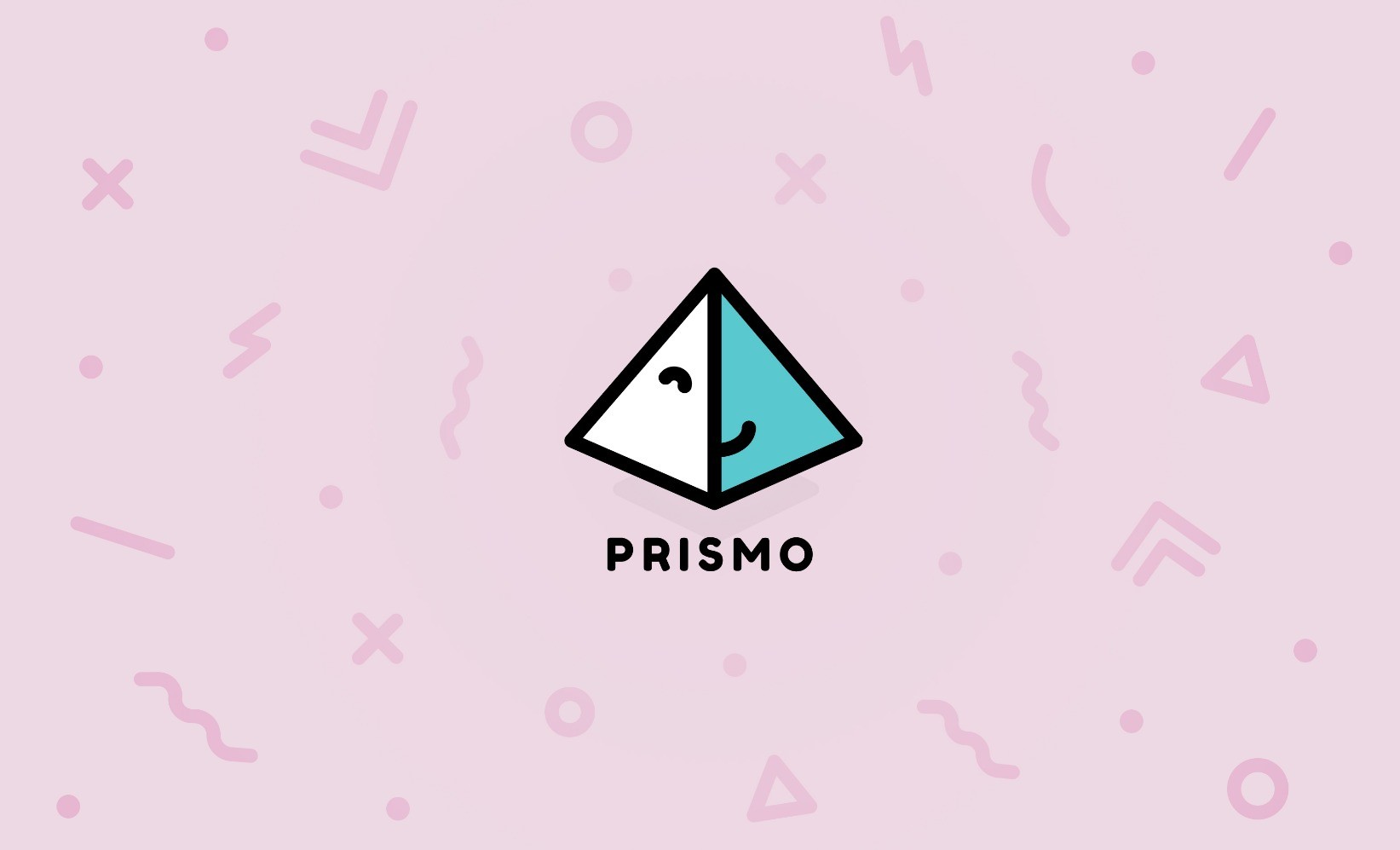
@prismo@mastodon.social
Meet our new #logo and mascot!
@metal_zealot@metalhead.club
Iron Age
#history #prehistory #iron #ironage #art #ambigram #ambigrams #calligraphy #typography #lettering #wordart #wordplay #logo #logoart #rotationalambigram #ambigramart
#symmetry #rotation #rotational #graphicdesign #type #font #fonts #creative #design
@metal_zealot@metalhead.club
Jimmy Neutron
#JimmyNeutron #Nickelodeon #cartoon #3dcartoon
#art #ambigram #ambigrams #typography #lettering #wordart #wordplay #rotationalambigram #ambigramart
#symmetry #rotation #rotational #graphicdesign #type #font #fonts #creative #design #logo
@JohneryCreatives@socel.net
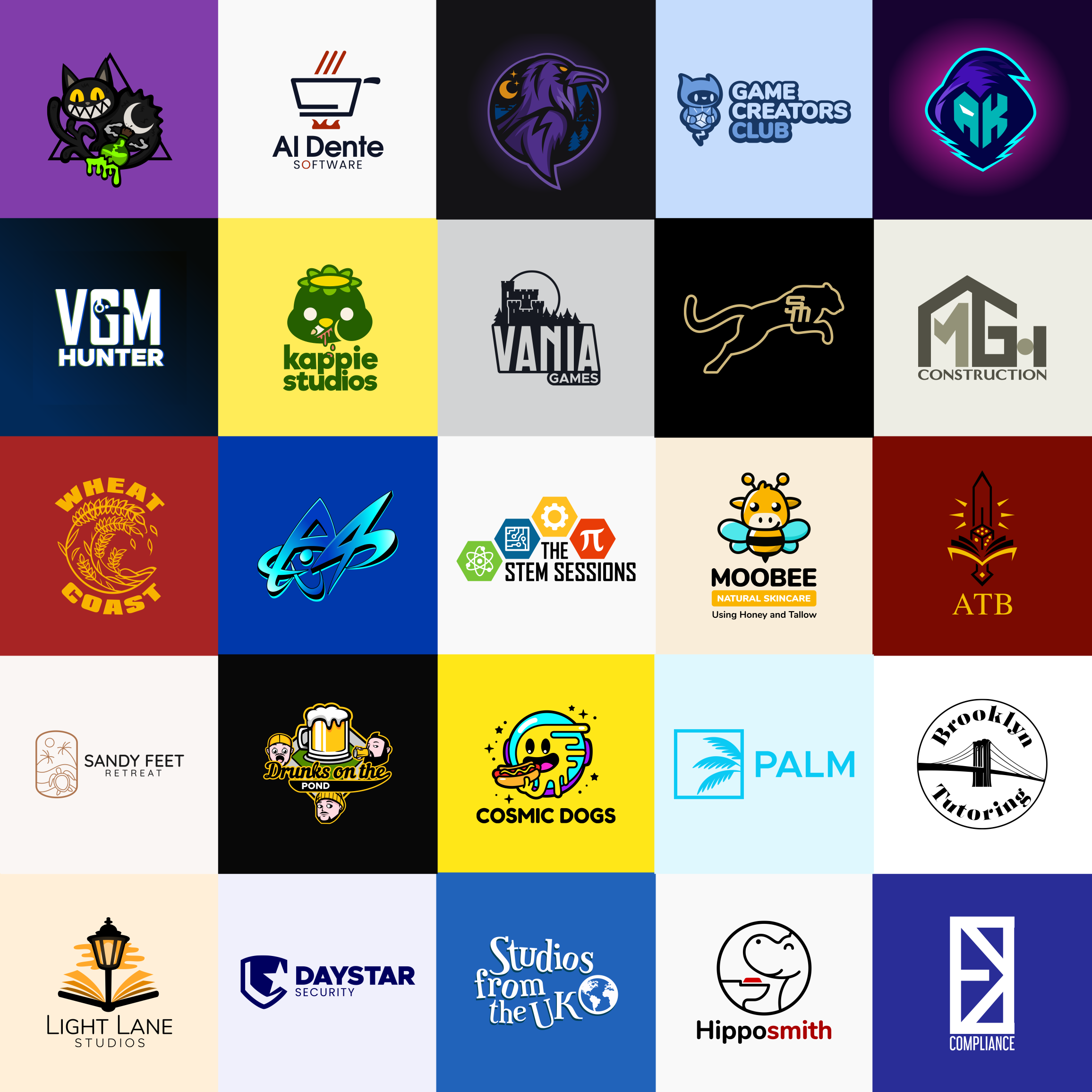
My logofolio for 2023 — a big thank you to my clients who trusted in my skills and expertise as a logo designer. I will be working even harder this year to make sure you get the best service possible!
I'm available for new projects! Feel free to message me here or through email at contact@johnery.com
@TyrKilcat@meow.social
Made a content label pack that you all can use for completely free to show off that your art is 100% AI Free :33
kilcat.carrd.co